Ocaso
Type
Product Design
Year
2018 - 2019
Company
Making Science
What is the context?
Ocaso is one of the leading companies in the Spanish insurance sector, and was one of the first offering life insurance to its customers; It has the largest insurance capital in the country. Its main value is the security and immediacy that it offers to its clients when solving a problem with a wide coverage of additional warranties.
Ocaso has a wide network of agents distributed throughout Spain in order to offer the best service to its customers. Ocaso is not a company that competes with price but for security.
What is the customer's need?
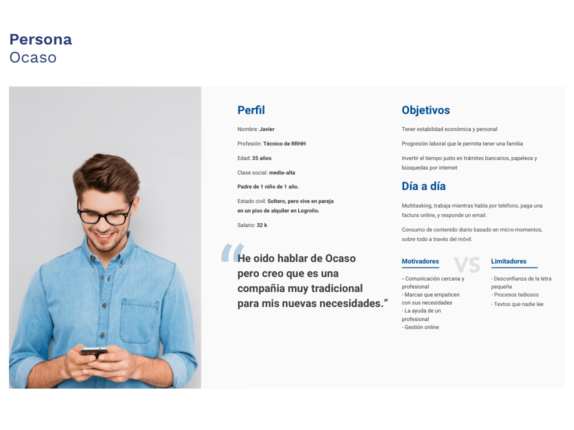
The Ocaso main need is to bring all its insurances closer to a new target of users (26 to 45 years old) that had never been enhanced, keeping the main essence of the company clarity and quality to its users by unlocking a new simple visual line without losing its tradition.
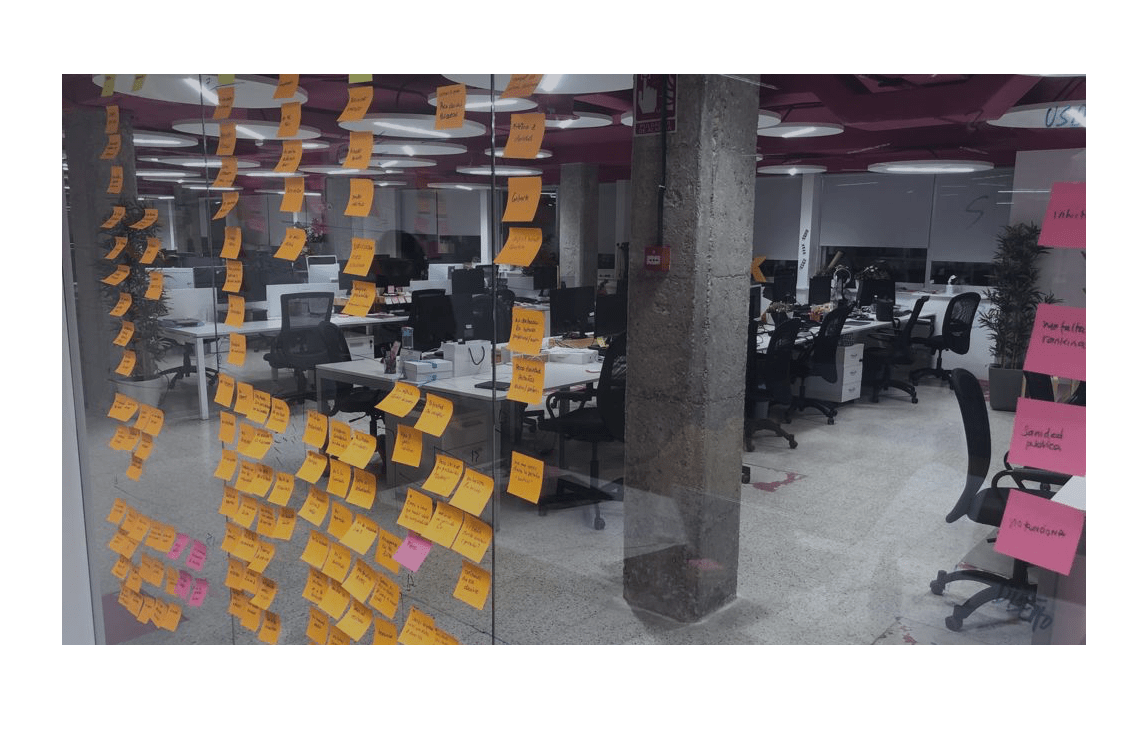
What did we discover?
To develop a strategy that met both the needs of the users and the client, it was necessary to know both first. A business research was developed to see the digital maturity of Ocaso linked to user research to discover their needs, preferences and habit through interviews and user surveys.
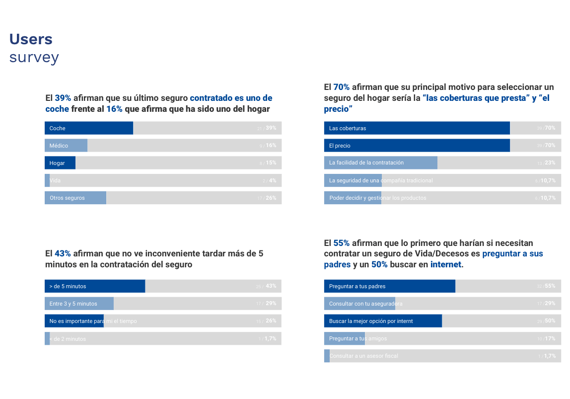
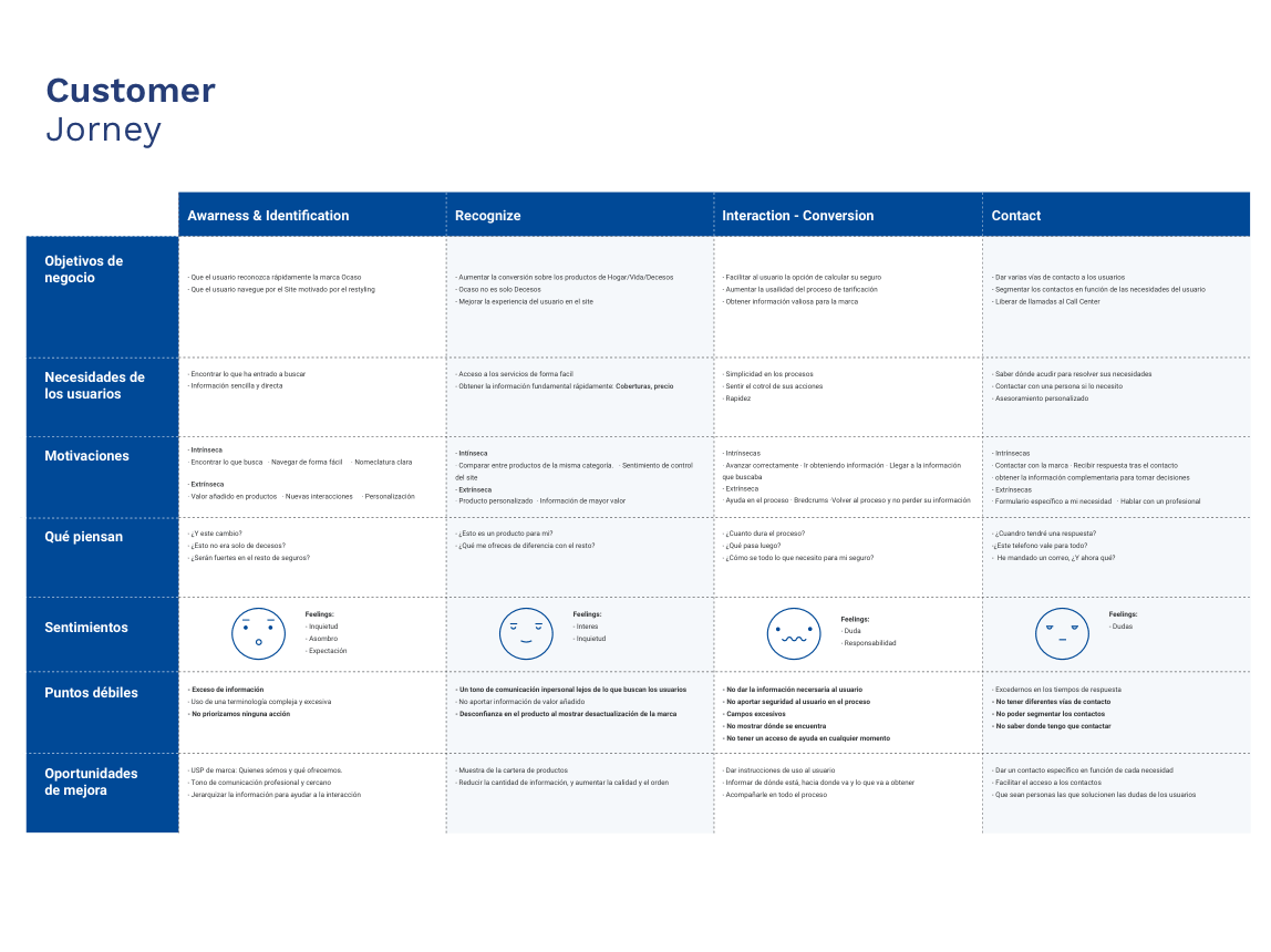
It was discovered that one of the biggest fears of users, when it comes to buying insurance, is not understanding the coverage that insurance offers them and the transparency that the insurances have with them.
On the other hand, users demand immediate attention when they have an incident since it is a crucial moment for them.
Therefore, the main objective of the redesign of the sunset website would be for the user to know how to understand and take out a sunset insurance, and at all times bring the user closer to the commercial network of agents, in order to generate a new commercial reference.
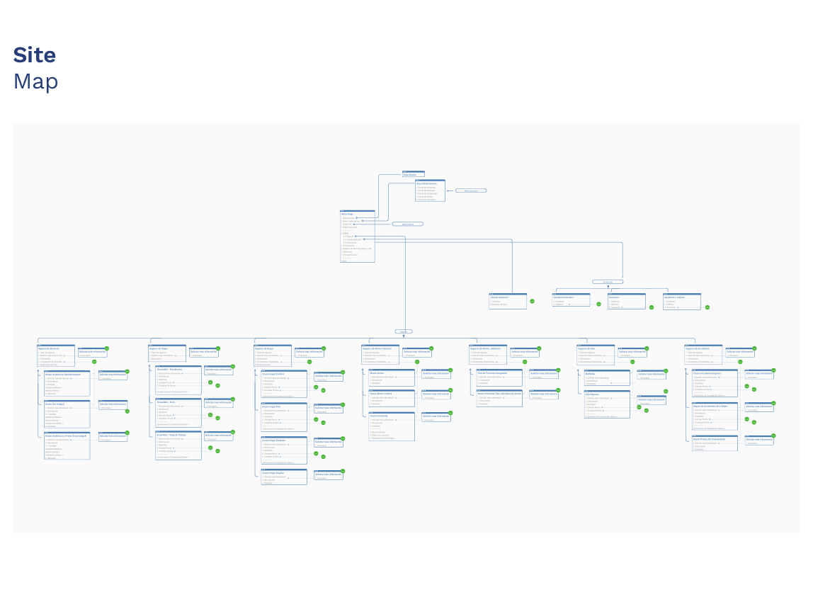
How is the information structured?
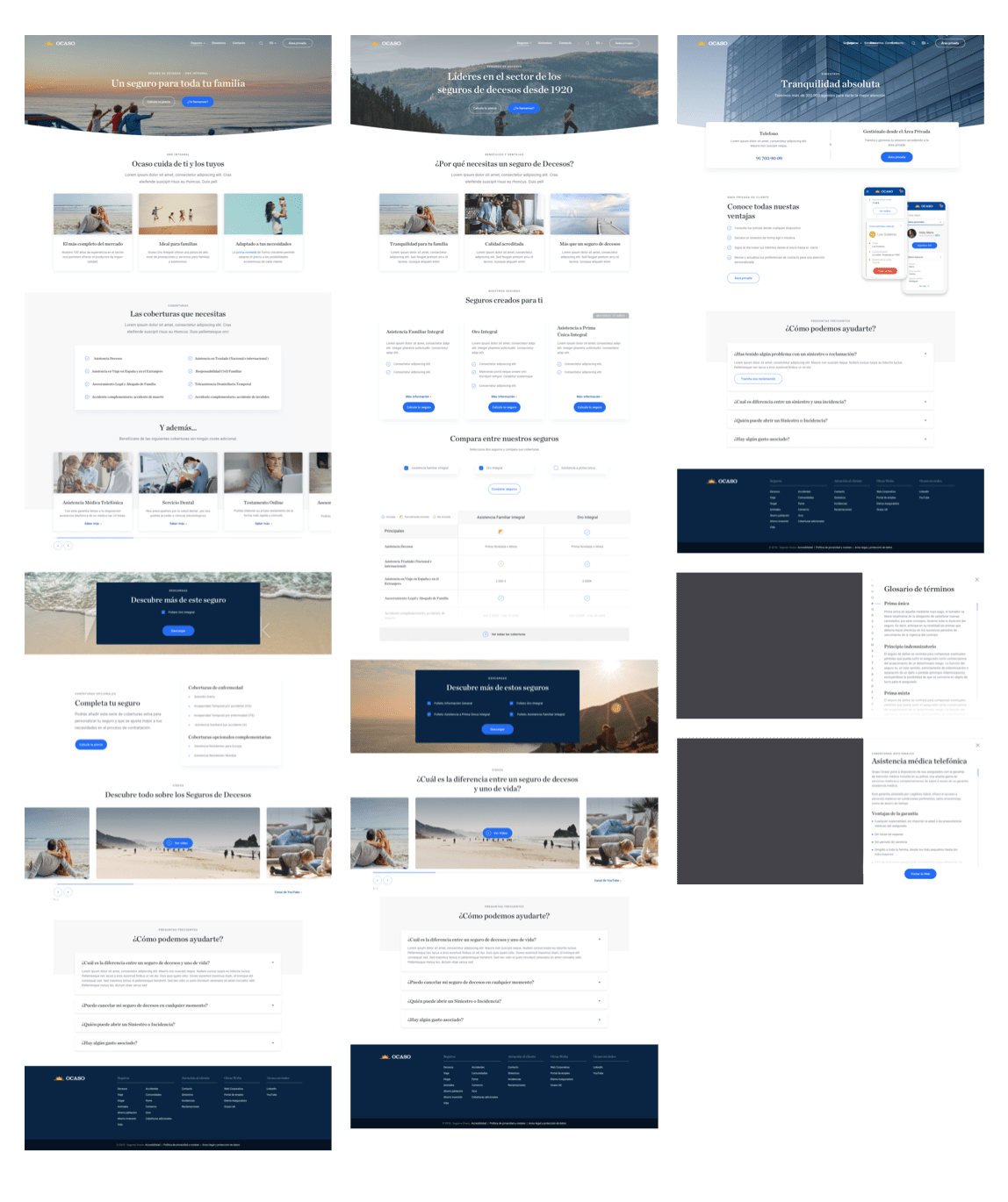
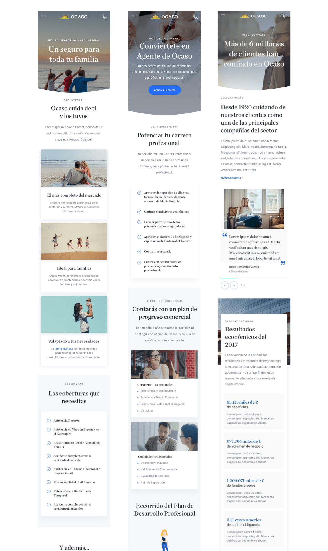
The information was divided into two large blocks, a commercial website and a corporate website, to respond to each user at a specific time. Everything necessary for the user to know, understand and hire an insurance and the necessary customer service to solve their doubts was hosted on the commercial website. The corporate website responds to all the needs of the users to know in detail the economic solvency of Ocaso.
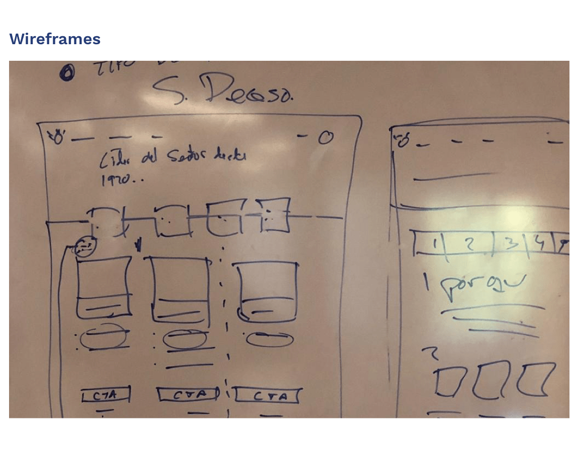
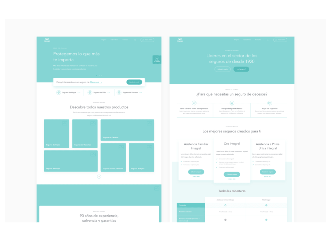
How was it designed?
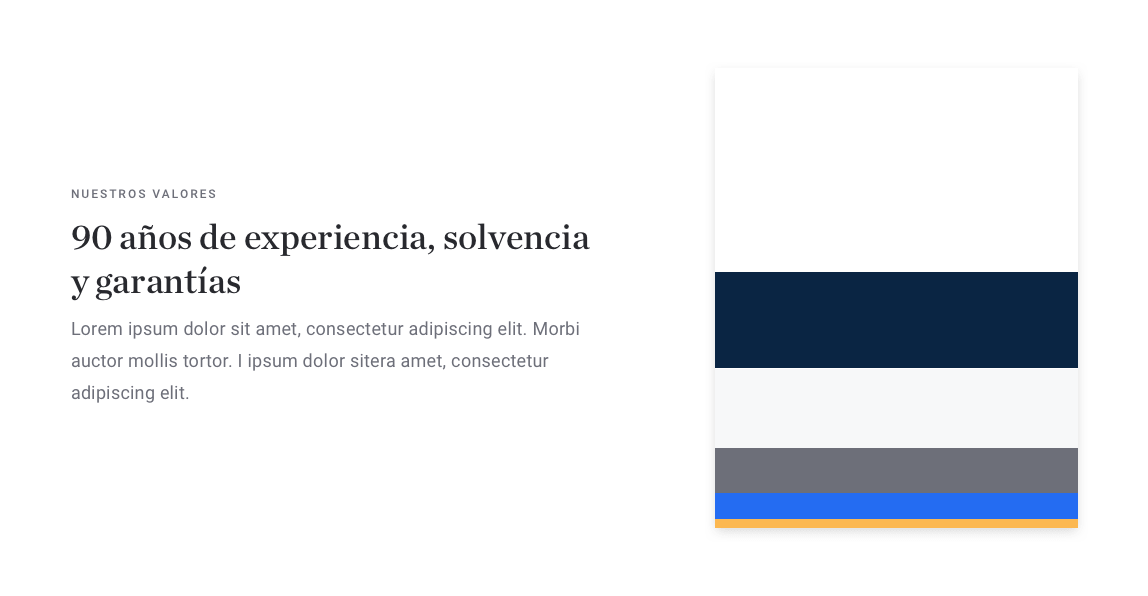
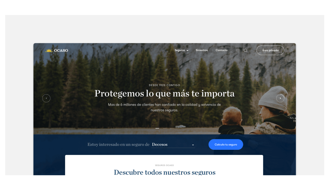
The design is based on the simplicity that Ocaso wanted to convey and on showing all the clear information without a high visual load. The typographical hierarchies were worked based on the visual style of the newspapers that represent tradition and trappings that are values that always accompany Ocaso. Always maintaining some color weights that identify the brand at all times.
